Introducing the New Creo Design | Our Brand Refresh
Today marks an important moment for us at Creo.
We’re launching a refreshed brand identity — including a new logo and updated brand elements — shaped not just by design decisions, but from a collaboration of our wider team of designers, developers, animators and marketers. This isn’t a sudden change. It’s the result of work that began last year with an internal brand workshop involving the entire team.
Built the Same Way We Build for Clients
Brand workshops are something we deliver regularly for clients across a wide range of sectors. They create structure and give us the honest insight we need to help take brands on their own journey.
So it felt right that we approached our own rebrand in exactly the same way.
We gathered the team. We listened to everyone’s views. We ran brand exercises. We challenged assumptions. We asked what Creo should feel like, not just how it should look.
That workshop became the foundation for everything that followed.
From there, we developed and refined new brand concepts before presenting them back to the team — just as we would with any client. The response was hugely positive. There was clear alignment around the direction, and genuine excitement about where it could take us.
We’re delighted to finally bring that work to life.
Why Refresh the Brand?
Our previous logo had served us well for many years, but it no longer reflected the energy or ambition behind our work. It felt slightly dated and more corporate than we wanted.
We were looking for something:
-
More creative
-
More approachable
-
More confident
-
Less corporate
-
More current
At the same time, recognition mattered. We’ve built strong relationships and a reputation we’re proud of. The refresh needed to feel familiar, not disconnected.
What’s Changed?
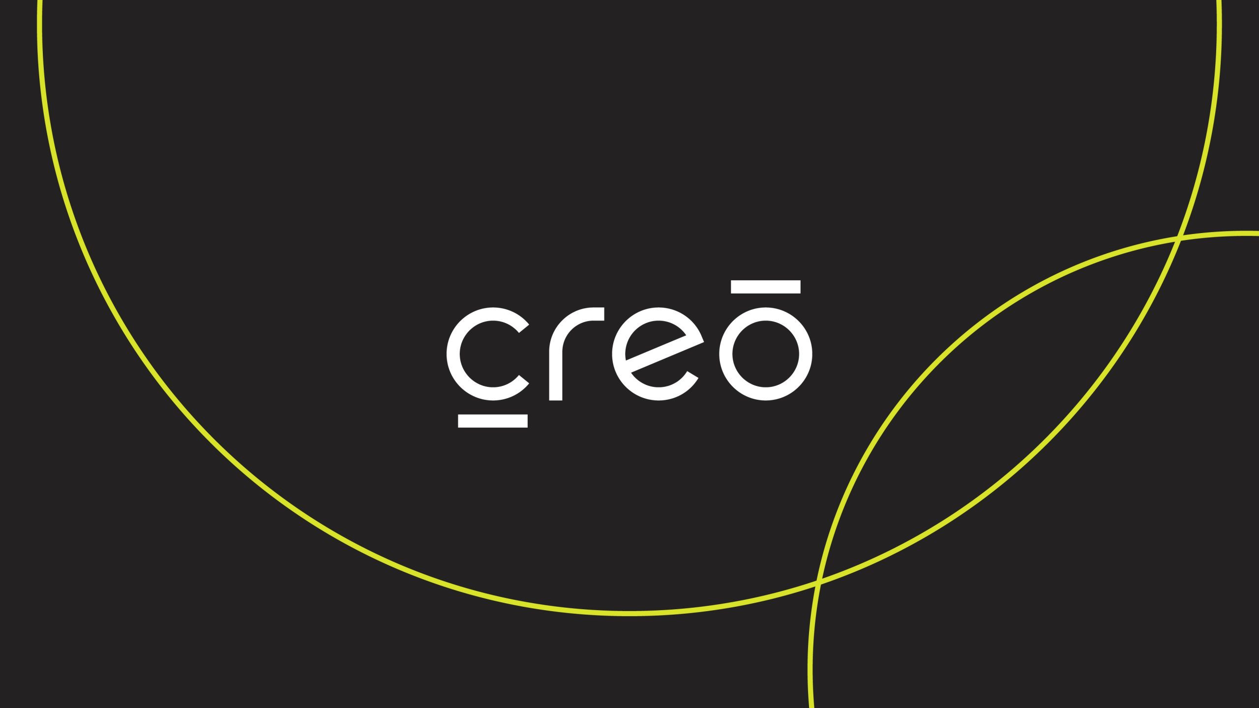
The new logo centres around a bold, lower-case wordmark. It’s friendlier and more expressive, reflecting the creative, collaborative way we work.
The typography is custom, geometric and consistent — built around balanced circular forms and unified line weights. These details may feel subtle, but they create cohesion across every touchpoint.
We’ve retained the core colour palette to keep the brand recognisable, refining rather than replacing. It’s an evolution — not a reinvention.
More Than a Logo
This refresh is about alignment.
Alignment between how we work and how we present ourselves. Alignment between the clarity of our process and the clarity of our identity. Alignment between our ambition and our expression.
The energy behind the new brand matches the way we approach brand workshops, web design, video production and digital innovation projects every day.
We’re excited about what this means for 2026 and beyond.
And if you’re considering your own brand refresh, this is your reminder that the strongest brands are built on collaboration, structure and honest conversation.
Let’s start the conversation: [email protected]